6 Advanced Data Analytical Tests
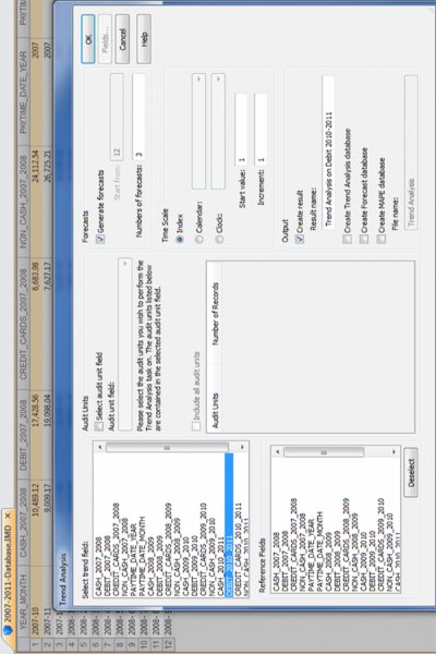
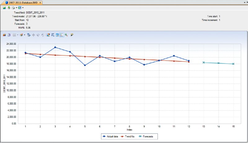
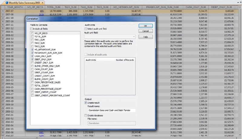
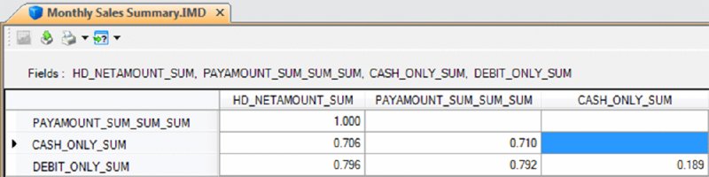
CHAPTER 6 WHILE CORRELATION, TREND ANALYSIS, and times series analyses are considered advanced statistical methods, they are easy to apply within IDEA. These tests are explained and demonstrated in IDEA. Tests to establish relationships between two fields have their procedures shown step by step in this chapter. These advanced data analytical tests are grouped together as they all establish some form of relationship testing. A correlation is a relationship between two things or mathematical variables that tend to vary or move together. The data is represented by the letters x and y where x is the independent variable and y is the dependent variable. The independent variable x is usually described first. There is usually some logical connection between the two variables. Many studies have been done on income levels of high school graduates, college, and university graduates and those with post-graduate degrees. The question in those studies is whether there is a connection or correlation between educational levels and income levels. Educational level would be x, the independent variable that would influence the income level variable of y, the dependent variable. How much does the independent variable have influence over the dependent variable can be determined by calculating the correlation coefficient and is designated as r. A perfect linear correlation would have r equaling to 1 and a perfect negative correlation would have r equaling –1. The closer r is to 1 or –1, the stronger the correlation. Where there is no correlation, r would equal to 0. There are three basic formulas for calculating r. The correlation coefficient can be calculated for the population, the sample, or the product moment. The most common one is the product-moment correlation coefficient as shown. Σ denotes the summation symbol, so the formula for the top part or numerator is to multiply the x variables by the y variables and then take the sum of those numbers. For the denominator, you square the x variables and take the sum of them. Do the same for the y variables and then multiple the resulting two sums. Apply the square root to the results and then divide the final results of the numerator by the final results of the denominator to obtain the correlation coefficient. Since we already know how to calculate the Z-scores (or have IDEA calculate it for us), a simpler method of obtaining r would be to multiply the Z-scores of the x variables by the Z-scores of the y variables and then total up all the results. Take the total of the results and divide by the number of records less one. The formula would be r = Σ(Zx * Zy)/(n – 1) where Zx is the Z-score for the x variable and Zy is the Z-score for the y variable. The letter n in the formula represents the number of records. In general, the correlation coefficient, whether negative or positive, can be interpreted as: The calculations of the correlation coefficients were shown for a better understanding of correlation. The auditor does not need to perform the calculations using the formulas, as IDEA has a built-in correlation feature that provides the correlation coefficient and you merely have to interpret the results. Using a summarized monthly sales file from a POS system, we select Correlation from the Statistics area of IDEA. For demonstration purposes, the fields we correlate will be the HD_NETAMOUNT_SUM field, which is the sales amount before taxes, and the PAYAMOUNT_SUM_SUM_SUM field, which are amounts paid that include taxes. We will also include payments of cash only and payments of debit cards only for the correlation calculation as shown in Figure 6.1. In addition to the results being displayed, which can be exported to various file formats, you may optionally create an IDEA database of these results. Figure 6.1 Applying the Advanced Statistical Analysis Correlation Feature of IDEA As expected, there is a perfect positive correlation of 1.000 between sales before taxes and payments. As sales go up or down, the sales tax moves accordingly, so the total payment by customers correlates to sales net of taxes. There is a strong correlation between both the cash tender and the debit cards tender to the payment amounts of 0.710 and 0.792, respectively. There is no correlation between cash and debit cards payments as the correlation coefficient is 0.189. See Figure 6.2. Figure 6.2 Correlation Coefficient Results While IDEA does not calculate the coefficient of determination, it can be done simply by squaring the correlation coefficient that is already calculated for you. The coefficient of determination, or r2, tells us how much of the variation in one variable can be attributed to the variation of the other variable. This calculation when multiplied by 100 will be expressed in a percentage. In our example of the correlation between cash tender and the payment amount of 0.710, 50.41 percent (0.710 × 0.710 × 100) of the variation can be attributed to the other variable. One has to be mindful that even if the variables are calculated to have a strong correlation, there may not be a cause-and-effect relationship. Are there direct cause-and-effect relations? That is, does x cause y or, in our previous example, does the level of education cause the income level? Maybe it is a reverse cause and effect where y causes x. That is, income levels determine your education level. Possibly there is a third variable or a combination of several other variables that caused the relationship, such as networking relationships while in school that resulted in higher paying jobs. Maybe the whole relationship between the two variables was just a coincidence? Trend analysis is based on regression analysis. Regression analysis produces a line of best fit and predictions can be made based on the line. It is also known as the least square line, because the line passes through the distribution where the distance squared from the line is minimized. Similar to that of correlation, the x variable can estimate or predict the y variable. That is, if x changes, then how much y changes can be estimated. For two numeric variables, you can predict y from the x variable if the the correlation coefficient is strong and there is a linear pattern for the variables. Normally you would want the r correlation coefficient to be better than plus or minus 0.60. Unless there is perfect correlation, the prediction for the value of y, given x, is merely a prediction. It is a guess but an educated guess with some sound scientific basis. The prediction will be subject to some amount of error. The standard error of the estimate measures how much the predicted values deviate from the actual y values. IDEA uses the mean absolute percent error (MAPE) to calculate the accuracy of predictions. MAPE is the average of the percentage errors, is expressed in percentage terms, and works best with positive amounts. The MAPE number is the predicted line on the average that is away from the actual line in percentages. Low MAPE values mean that the past data has a good fit to the regression line and you can have more confidence in the data and prediction. To use trend analysis in IDEA, the database needs at least one numeric field, and the field where trend analysis is to be applied cannot contain any bad data. The database cannot contain more than 65,536 records. The audit unit field cannot be the same field as the trend analysis field. In addition, the database should not contain seasonal data. If it contains seasonal data, then time series analysis should be selected over trend analysis. time series works similarly to trend analysis. In our data file, we will perform trend analysis on the 12-month data from the debit card payments field of DEBIT_2010_2011 and generate 3 months of forecasts. It is not necessary to provide a reference field or audit units. Refer to Figure 6.3. Figure 6.3 Applying the Advanced Statistical Trend Analysis in IDEA For debit card payments, it is trending slightly downward, and it is predicted that at the end of the three months, debit payments would drop to approximately $18,000 for that month as seen in Figure 6.4. Figure 6.4 Trend Analysis Results of Debit Card Payments with Forecast of Three Months The MAPE is 5.36 percent, which provides high confidence as the reliability of the predictions. In contrast to the debit card payments, cash payments are trending upward when we select CASH_2010_2011 as the field to trend.
Advanced Data Analytical Tests
 CORRELATION
 TREND ANALYSIS