Your Website and Its Supporting Elements

Figure 24. Your Website as your Ecosystem’s core.
Once you have a great website in place, you will begin developing your Ecosystem by way of supporting elements. As you develop your supporting elements, such as your blog and videos, you will commence with traffic generation, described in Chapters 11, 12, and 16. And during the course of your Ecosystem development and traffic generation, you will start creating and maintaining various points of engagement, primarily, your social media.
The Ecosystem’s Core: Your Law Firm’s Website
At the core of your Ecosystem is your law firm’s website that will usually be the point of contact for people who are seeking legal help online. Whether they choose to make contact with you or not depends on how they respond to your website’s content—its look, feel, and ease of use.
Components of a successful website
It is important to consider how effective your website will be in getting people to want to make contact with you through it. You can bring thousands of visitors to the wrong website and have nothing to show for it at the end of the month. We have discussed earlier in this book that with the right website you should expect between 5% and 10% of your website visitors to want to make contact with you when they reach it. Your Analytics data should give you some idea whether your website is performing to expectations.
Your website should be in accord with modern design trends. An archaic-looking website without a version formatted for mobile devices will look unprofessional to many whereas people will respond better to a modern website that looks great on their smart phones, Kindles, iPads, and PCs.

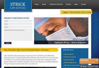
Figure 25. An example of a website that generates a very high percentage of client inquiries.
Your website should be easy for the visitor to navigate to the content they want. Simple, easy-to-use navigation throughout your website is very important because you do not know which page on your website will be the entry page for the user. Google does not always serve up the homepage of a website when it is deciding which pages on the Internet are most relevant to the searcher’s query.
A famous study in a grocery store determined that the number of free samples that led to the largest number of products sold off the shelves was six. The study found that if shoppers were presented with fewer options than six, they felt that they were being steered toward specific brands, and when presented with more than six, they felt overwhelmed and did not buy.

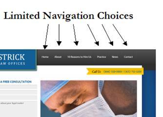
Figure 26. Limiting top navigational choices to around six.
I believe that the findings of this study have a broader application to websites. In particular, we find that fewer navigational choices are better for keeping people on your website. Perhaps superstitiously, I try, when I can, to keep above-the-fold navigational choices to around six or seven, with at least one of them, of course, being “Contact Us.”
Often the content of attorneys’ websites is very informative but doesn’t necessarily speak directly to a person who is looking to hire an attorney on an emotional level. Information-heavy content may be hugely beneficial to people who are searching the web for legal information, but to reach people who are ready to hire, the content needs to be tailored to their needs.

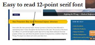
Figure 27. Easy-to-read and easy-to-skim content.
Your pages should speak to the likely circumstances and frame of mind of your ideal client, speaking to their probable preferences when hiring a lawyer for their type of legal problem. For example, if you are a family lawyer, your content might be warm and friendly because that client type may be looking for a caring, compassionate type of attorney. If you are a criminal defense attorney, your content might be more serious because that client type may be looking for a hard-as-nails litigator, so you might include in your content words like “tough” and “driven.”
We also need to be mindful of generational differences. It’s been found that “Millennials,” millions of whom are already in their mid-30s, often are more moved by information about what you do in the community and why you became a lawyer, rather than where you went to law school and how long you have been practicing law.
Emotive content is much more important than substantive law. After all, we are targeting people who are trying to fill a legal need, not people who are looking for an answer to a legal question. If your law practice relates to workplace injuries, rather than have your practice area page read like a textbook about workers compensation law, it should reach out to the injured employee, appealing to them on an emotional level about how stressful it can be in this economy to be out of work and how hard it can be to support a family while injured.
One other audience you’re writing for is your state’s licensing authority, so your website content must comply with your local rules of professional conduct. I will discuss the ethics considerations of your online content in Chapter 15.
The importance of good photography cannot be overstated. People will decide whether they want to stay on your website in a period lasting 3 to 5 seconds, and engaging photography can help keep them there. Photos of law books, gavels, and scales of justice have been done to death and offer little visual interest anymore. But if you are a criminal defense lawyer, a photo of a row of police cars can make a difference. Likewise with family law, in place of that tired photo of the courthouse steps, include a photo of a little girl in a swimming pool and you will find fewer people “bouncing”[4] from that page.

Figure 28. Sample image relating to car accidents.